")
I wanted to use the title “Black Ink, White Paper” but it sounds like I’m discussing race – Not this time, lol!
It’s about ink.
I use a cavalcade of colors when I write my creative works, simply because I can. But! In the pen that I use for when I’m out and about and in need of a pen to jot something or fill out a form, I use an Herbin fountain pen ballpoint and the ink I use is always black ink. Because I’m not writing creatively, I’m filling out a form. Black ink only for me.
In fountain pen inks, not all inks are alike, including black ink. Turns out, there’s a lot of variety in the one color that consumes all color. One thing I do, certainly, is also not really get a black ink from a brand that I use for creative works. Thus, I have no Diamine black inks, Colorverse black ink, Ferris Wheel Press black inks, nada. It’s to keep things distinct and separate in my head. Also, my Herbin pen uses a Monteverde charger, so it doesn’t hold a bunch of ink, perhaps 1.25 ml at best (my TWSBI Vac700R, what I use for my creative works, holds up to roughly 3ml ink. A lot, in other words), therefore I have been buying samples and not bottles of black ink.
I had Edelstein’s Onyx in there but finally ran out (it was ok/meh (great on cardboard and nice paper tho) but I’ll eventually get another sample to swatch) and now I’m trying out Waterman’s Intense Black.
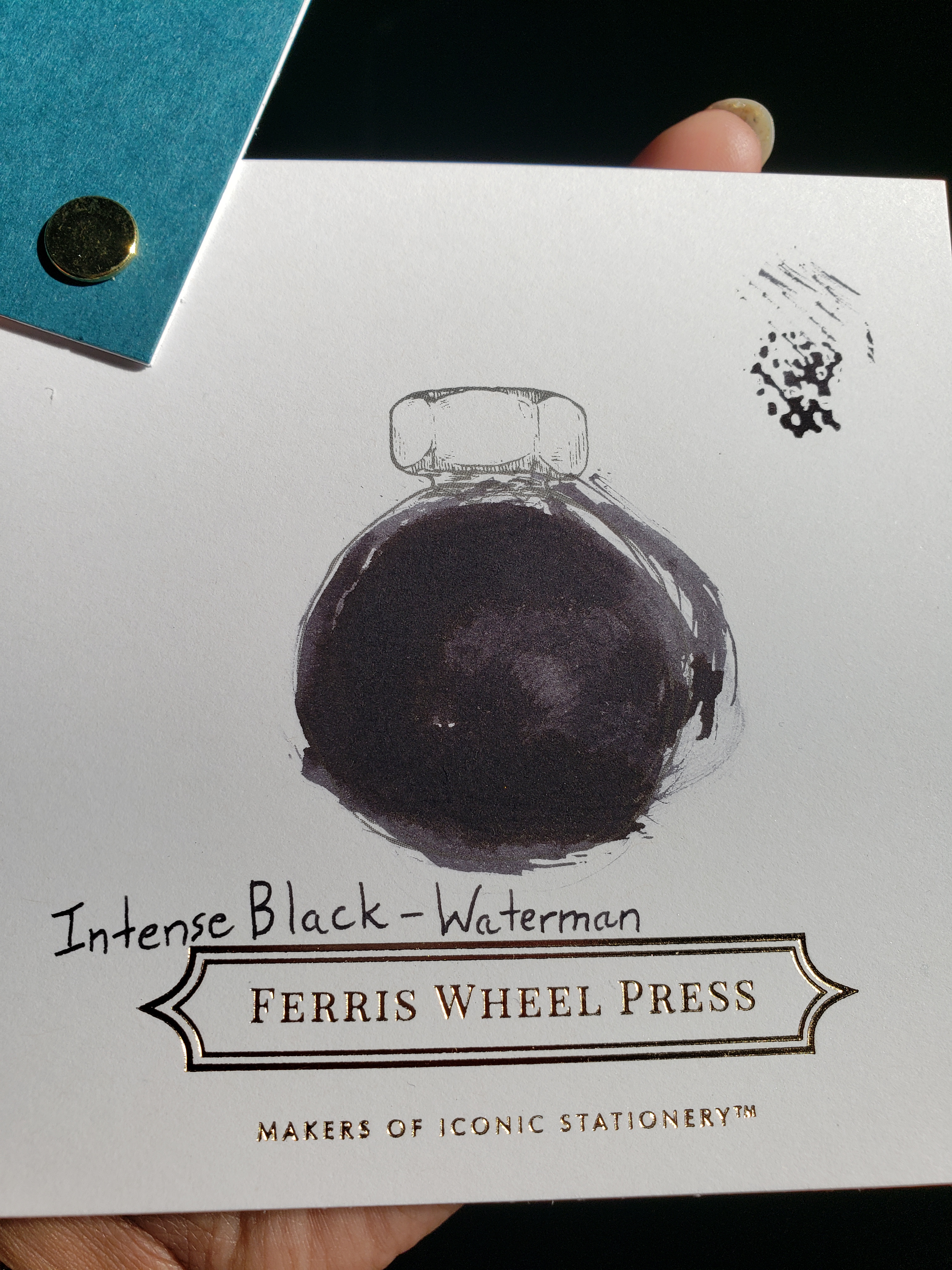
It’s … a’ight. It’s a black ink, alright, but not “Pits of My Weary, Deathly Soul; Only Defeated Sorrow & Grievous Pain Live Here” black. I was promised “intense” and all I got was “moody at best”. It’s close to the first black ink I got, Higgins black fountain pen ink – which I hated because it was basically smeared dark grey charcoal on paper. And only played nice on good paper but sucked on plain office paper.
I want “lost in the depths of suicide black” level of intense, not “my favorite team didn’t win and now I’m bummed black” level of intense. It’s giving “serene Japanese calligraphy writing”, I want “disgraced seppuku”. The color of despair, not the color of “It’s rough but I’m finally getting a little bit of help, tryna hang in there”.
Yes, I want 10/10 drama, even with filling out a form. Because forms are despairing in their own right, it’s only fair. Fight me but you know I’m right.
It’s a Waterman also. French ink and pen maker, Stephen King writes with their pens. I do not like the idea of overlapping with him because I just want to do my own thing simply so I’m also planning to sample Caran d’Ache cosmic black and maybe Herbin’s Noir Inspiration (because it is scented and I really, really wanted a scented ink but there are super limited choices. The nanosecond a non-White ink brand makes a broadly available scented ink in a good color, I’m nabbin’ it. Or Ferris Wheel Press, my exception). Yes, that is a lot of French inks. And pen. And ink charger. We are officially in France now. Bienvenue.
Waterman’s Intense Black performs better on cheap copy paper than Edelstein’s Onyx, that’s certain, but Onyx puts down a much darker line. No sheen in either (that I spotted), and Intense Black will shade but doesn’t show in Eastern extra fine points (Supa! thin lines, in other words. You could draw blood with those nibs), just anything thicker than that that, like a Western Fine point (which is like a medium, .07mm line) will show some shade, especially if you don’t write in cursive. If you write in cursive, like I do, you’ll still see some shading but not as much as print hand.
I think once I find a good black ink (that has a pretty, nice-looking bottle), I’ll get a bottle of that ink and have it just be my mainstay ink for my ballpoint pen.

Leave a comment